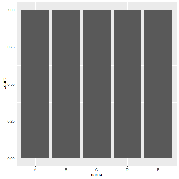
柱状图是比较常用的图形,主要用于表示不同种类 对象的数量 。柱状图不适用于描述连续数据,最好用来描述不同类别的数据。描述数量时,这里包含两种想法,一是描述某类对象本身特征的数据(identity),二是描述某类对象总量的数据(count)。画图时要区分两者。
1
2
3
4
5
library ( tidyverse )
data <- data.frame ( name = c ( "A" , "B" , "C" , "D" , "E" ), value = c ( 3 , 12 , 5 , 18 , 45 ))
data %>% ggplot ( aes ( x = name , y = value )) + geom_bar ( stat = 'identity' ) # left
# data %>% ggplot(aes(x = name, y = value)) + geom_col()
data %>% ggplot ( aes ( x = name )) + geom_bar () # right; stat = 'count'
left: stat_identity, right: stat_count
 1
 2
 3
 4
 5
 6
 7
 8
 9
10
11
12
13
14
15
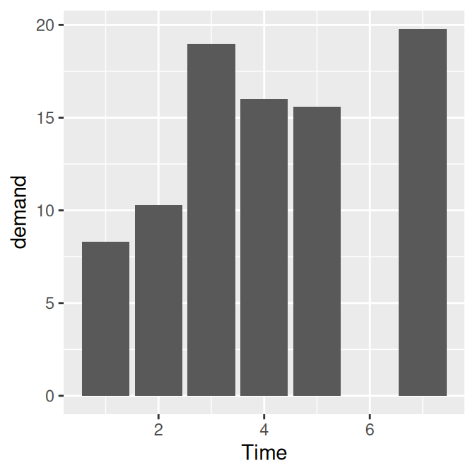
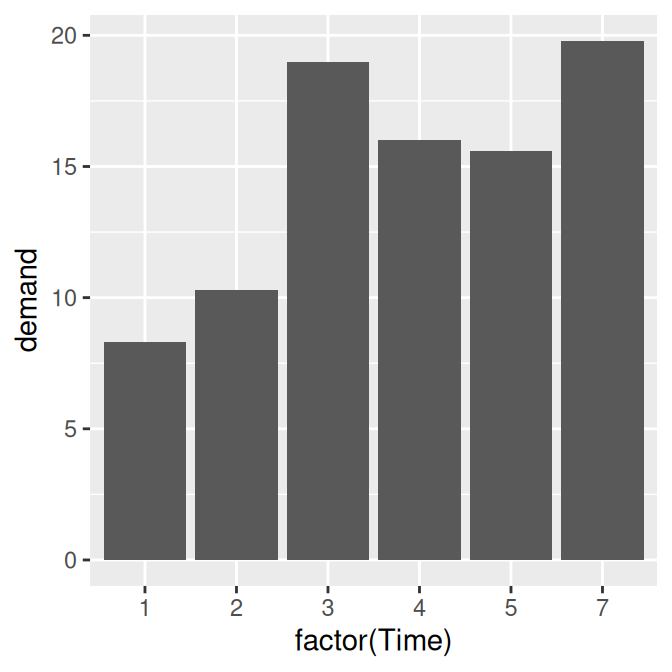
BOD
# Time demand
# 1 1 8.3
# 2 2 10.3
# 3 3 19.0
# 4 4 16.0
# 5 5 15.6
# 6 7 19.8
str ( BOD )
# 'data.frame': 6 obs. of 2 variables:
# $ Time : num 1 2 3 4 5 7
# $ demand: num 8.3 10.3 19 16 15.6 19.8
# - attr(*, "reference")= chr "A1.4, p. 270"
BOD %>% ggplot ( aes ( x = Time , y = demand )) + geom_col () # continuous
BOD %>% ggplot ( aes ( x = factor ( Time ), y = demand )) + geom_col () # factor; discrete
left: continuous, right: discrete
geom_bar() 的结果类似。当画柱状图时,注意确保分类变量为因子类型。
以上就是 ggplot2 里面基本的柱状图画法了,这里就会自然想到一些关于柱状图的问题:
可以换颜色吗?
可以调整柱子宽度和间隔吗?
可以调整柱子从左至右的顺序吗?123457 变成754321?
可以把XY轴换一下吗?
1个类别有多个数据想画柱状图怎么办?即分组画图,上色,注释等
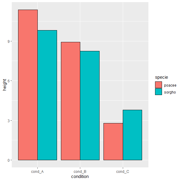
很多情况下,数据的分类变量有2个而非1个。画柱状图时,我们将1个分类变量分配到X轴,另一个分类变量就可以分配给颜色,这样比较起来就比较直观了。
 1
 2
 3
 4
 5
 6
 7
 8
 9
10
11
12
13
14
15
16
17
18
19
20
data <- data.frame (
specie = c ( rep ( "sorgho" , 10 ) , rep ( "poacee" , 10 ) ),
cond_A = rnorm ( 20 , 10 , 4 ),
cond_B = rnorm ( 20 , 8 , 3 ),
cond_C = rnorm ( 20 , 5 , 4 )
) %>% pivot_longer ( cond_A : cond_C , names_to = 'condition' , values_to = 'value' ) %>%
group_by ( specie , condition ) %>% summarise ( height = mean ( value ), sd = sd ( value ))
data
# A tibble: 6 x 4
# Groups: specie [2]
# specie condition height sd
# <fct> <chr> <dbl> <dbl>
# 1 poacee cond_A 11.4 3.23
# 2 poacee cond_B 8.92 2.75
# 3 poacee cond_C 2.79 4.38
# 4 sorgho cond_A 9.81 4.73
# 5 sorgho cond_B 8.25 3.99
# 6 sorgho cond_C 3.78 4.81
data %>% ggplot ( aes ( x = condition , y = height , fill = specie )) +
geom_col ( position = 'dodge' , color = 'black' )
实际上,我们可以将另一个分类变量映射到color或者linetype上,不过映射到fill是最直观的。那么我们又自然想到一些问题:
柱状图上可以加数字或者error bar 吗?
颜色映射有默认值,如何自己赋值?
右侧的图例自己出现了,可以控制吗?
如果需要在柱状图上添加颜色的话,我们可以通过将颜色映射到 fill 上来实现。
 1
 2
 3
 4
 5
 6
 7
 8
 9
10
11
12
library ( gcookbook )
head ( uspopchang )
# State Abb Region Change
# 1 Alabama AL South 7.5
# 2 Alaska AK West 13.3
# 3 Arizona AZ West 24.6
# 4 Arkansas AR South 9.1
# 5 California CA West 10.0
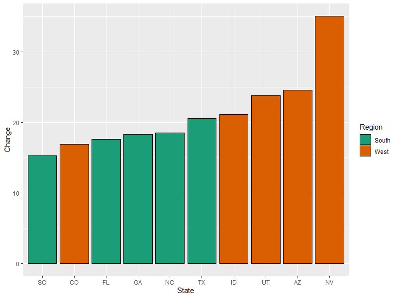
# 6 Colorado CO West 16.9
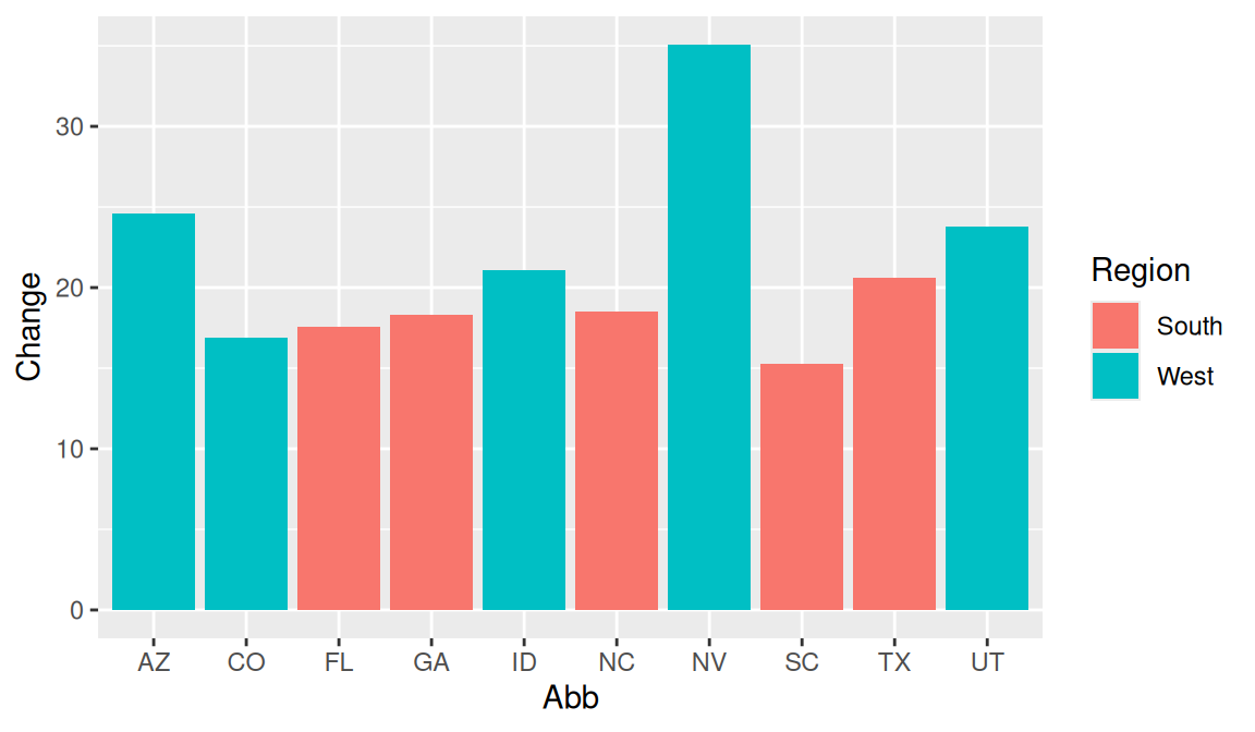
uspopchange %>% arrange ( desc ( Change )) %>% slice ( 1 : 10 ) %>%
ggplot ( aes ( x = Abb , y = Change , fill = Region )) +
geom_col ()
这里有两个问题:柱子可以用Change来排序吗?颜色如何自己赋值?
1
2
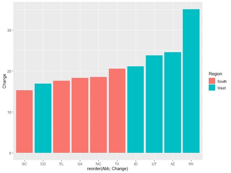
topc %>% ggplot ( aes ( x = reorder ( Abb , Change ), y = Change , fill = Region )) + geom_col ()
# 对 Abb这个因子按照Change重新排序后,ggplot画图就不会用默认的字母排序顺序了
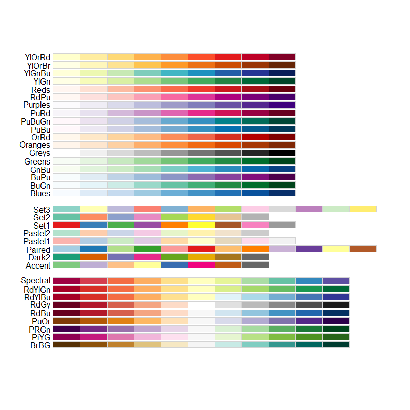
接下来是自定义颜色的问题,ggplot肯定默认有一组颜色,当然也提供了 scale_fill_brewer 以及 scale_fill_manual 两个函数,前者是定义好的一些颜色,后者接受颜色代码。对于前者,我们可以直接打印出来,可以参考 ColorBrewer: Color Advice for Maps (colorbrewer2.org) 网页来选择颜色。
1
RColorBrewer :: display.brewer.all ()
后一种的话,可以用十六进制颜色代码。
1
2
3
4
5
6
7
8
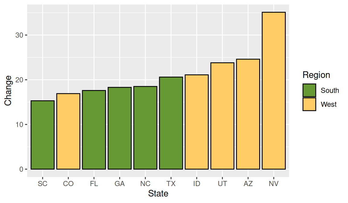
topc %>% ggplot ( aes ( x = reorder ( Abb , Change ), y = Change , fill = Region )) +
geom_col ( color = 'black' ) +
scale_fill_manual ( values = c ( "#669933" , "#FFCC66" )) +
xlab ( "State" ) # 1
topc %>% ggplot ( aes ( x = reorder ( Abb , Change ), y = Change , fill = Region )) +
geom_col ( color = 'black' ) +
scale_fill_brewer ( palette = "Dark2" ) +
xlab ( "State" ) # 2
有时候,我们可能会有正负数据,这时用柱状图也是可以的。
 1
 2
 3
 4
 5
 6
 7
 8
 9
10
11
12
13
14
head ( climate )
# Source Year Anomaly1y Anomaly5y Anomaly10y Unc10y
# 1 Berkeley 1800 NA NA -0.435 0.505
# 2 Berkeley 1801 NA NA -0.453 0.493
# 3 Berkeley 1802 NA NA -0.460 0.486
# 4 Berkeley 1803 NA NA -0.493 0.489
# 5 Berkeley 1804 NA NA -0.536 0.483
# 6 Berkeley 1805 NA NA -0.541 0.475
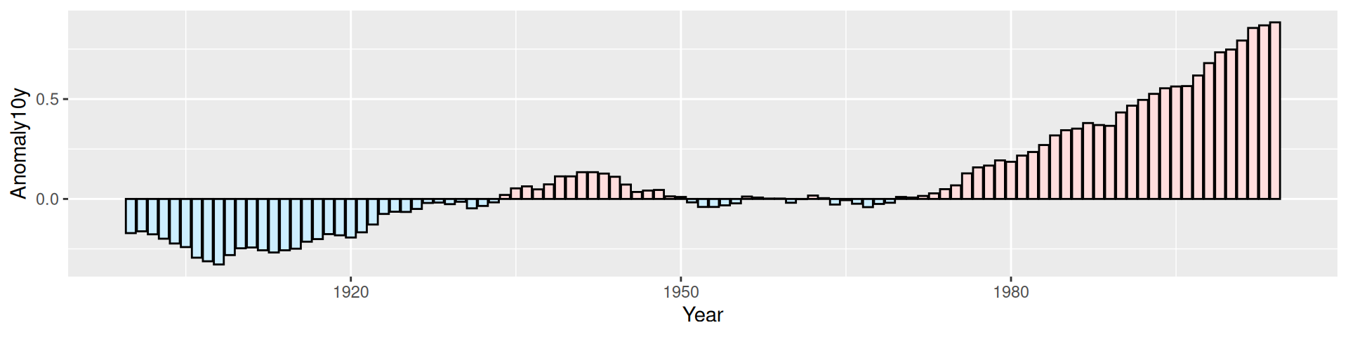
climate %>% filter ( Source == "Berkeley" & Year > 1900 ) %>%
mutate ( pos = Anomaly10y >= 0 ) %>%
ggplot ( aes ( x = Year , y = Anomaly10y , fill = pos )) +
geom_col ( color = 'black' , size = 0.25 , position = 'identity' ) +
scale_fill_manual ( values = c ( "#CCEEFF" , "#FFDDDD" ), guide = FALSE )
这里正负轴已经可以代表“正负”含义了,因此,去掉了图例。
柱状图的柱子宽度以及柱子间的距离怎么调?
 1
 2
 3
 4
 5
 6
 7
 8
 9
10
11
12
13
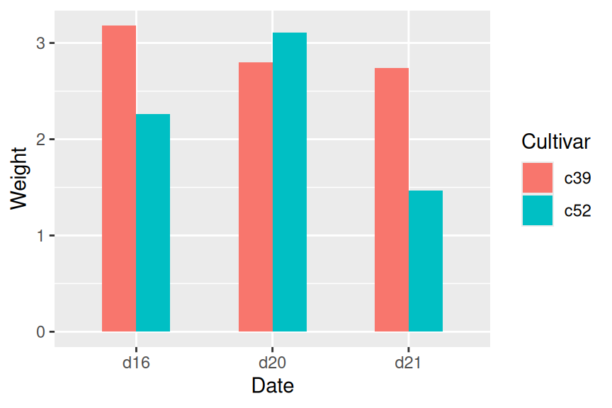
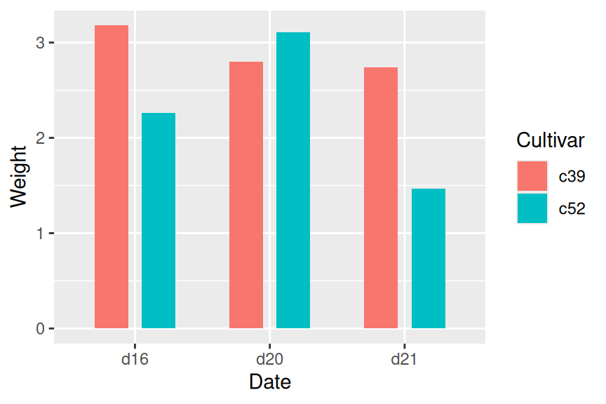
cabbage_exp
# Cultivar Date Weight sd n se
# 1 c39 d16 3.18 0.9566144 10 0.30250803
# 2 c39 d20 2.80 0.2788867 10 0.08819171
# 3 c39 d21 2.74 0.9834181 10 0.31098410
# 4 c52 d16 2.26 0.4452215 10 0.14079141
# 5 c52 d20 3.11 0.7908505 10 0.25008887
# 6 c52 d21 1.47 0.2110819 10 0.06674995
ggplot ( cabbage_exp , aes ( x = Date , y = Weight , fill = Cultivar )) +
geom_col ( width = 0.5 , position = "dodge" )
ggplot ( cabbage_exp , aes ( x = Date , y = Weight , fill = Cultivar )) +
geom_col ( width = 0.5 , position = position_dodge ( 0.7 ))
width 控制柱子宽度,position_dodge 我理解为组内间距,默认与 width 值相同。两者的默认值均为0.9。
有时候也需要把柱子堆起来,我感觉一般用在百分比占比之类的数据上吧。这里也会产生几个问题:
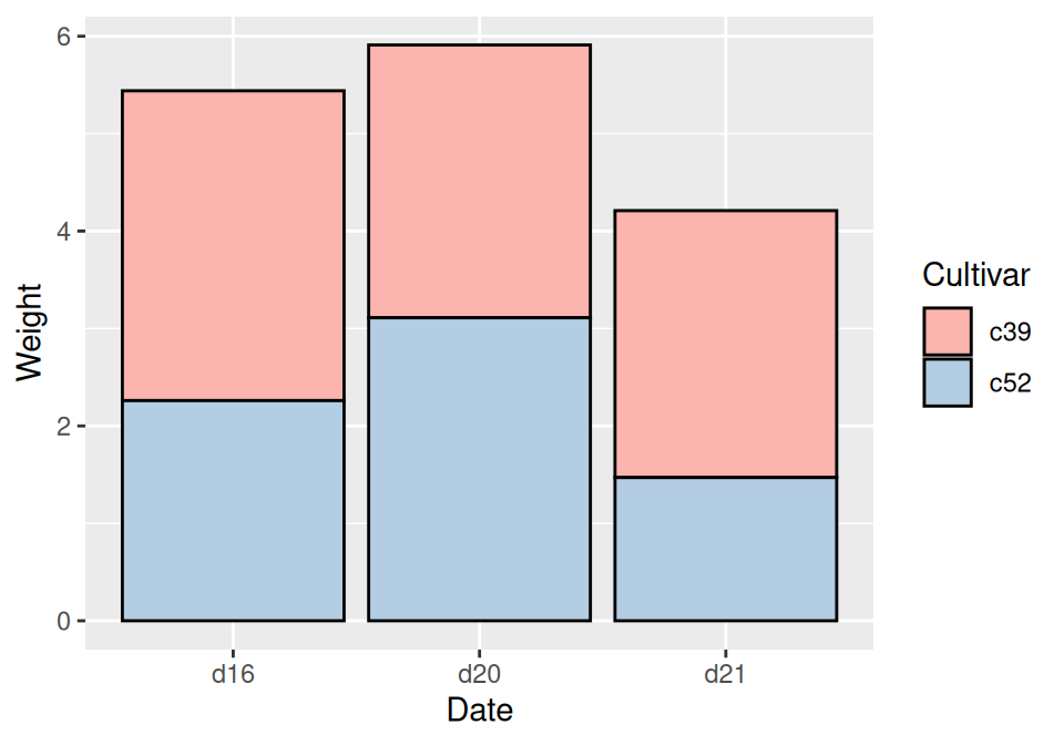
首先是基本的堆叠柱状图:
1
2
3
cabbage_exp %>% ggplot ( aes ( x = Date , y = Weight , fill = Cultivar )) +
geom_col ( color = 'black' ) +
scale_fill_brewer ( palette = 'Pastel1' )
这个图有两个分类变量,Date已经在X轴上了,前面演示过用 reorder 来改变顺序。Cultivar被映射到fill上了,它的顺序其实不是那么重要我感觉,只要是对的就可以。不过ggplot2提供了一个reverse选项可以让堆叠柱状图组内顺序反转。
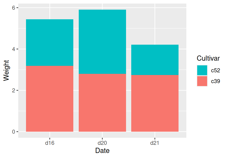
1
2
3
ggplot ( cabbage_exp , aes ( x = Date , y = Weight , fill = Cultivar )) +
geom_col ( position = position_stack ( reverse = TRUE )) +
guides ( fill = guide_legend ( reverse = TRUE )) # legend顺序反转
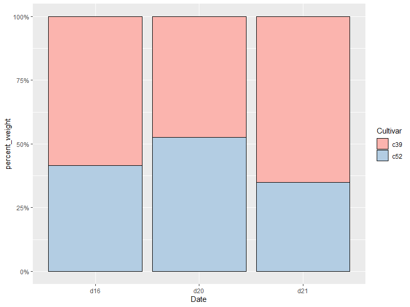
堆叠图很多情况下用于百分比,那么问题就是如何显示百分比:
1
2
3
4
5
6
cabbage_exp %>%
group_by ( Date ) %>%
mutate ( percent_weight = Weight / sum ( Weight )) %>%
ggplot ( ce , aes ( x = Date , y = percent_weight , fill = Cultivar )) +
geom_col ( color = 'black' ) + scale_y_continuous ( labels = scales :: percent ) +
scale_fill_brewer ( palette = "Pastel1" )
给柱子加标签需要两个数据,一是标签内容,二是标签位置。
1
2
3
4
5
6
7
ggplot ( cabbage_exp , aes ( x = Date , y = Weight , fill = Cultivar )) +
geom_col ( position = "dodge" ) +
geom_text (
aes ( label = Weight ),
colour = "white" , size = 3 ,
vjust = 1.5 , position = position_dodge ( .9 )
)
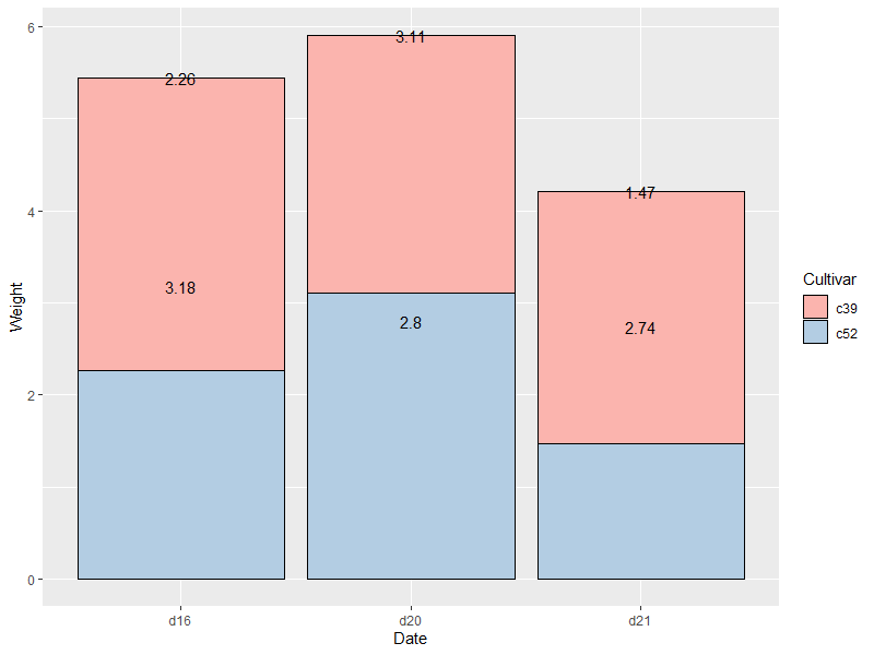
各个参数作用比较明确。上面是dodge分布,如果是stack分布的话,加labels就需要进行一番计算了。
 1
 2
 3
 4
 5
 6
 7
 8
 9
10
11
12
cabbage_exp %>% arrange ( Date , Cultivar ) %>%
group_by ( Date ) %>% mutate ( label_y = cumsum ( Weight ))
# A tibble: 6 x 7
# Groups: Date [3]
# Cultivar Date Weight sd n se label_y
# <fct> <fct> <dbl> <dbl> <int> <dbl> <dbl>
# 1 c39 d16 3.18 0.957 10 0.303 3.18
# 2 c52 d16 2.26 0.445 10 0.141 5.44
# 3 c39 d20 2.8 0.279 10 0.0882 2.8
# 4 c52 d20 3.11 0.791 10 0.250 5.91
# 5 c39 d21 2.74 0.983 10 0.311 2.74
# 6 c52 d21 1.47 0.211 10 0.0667 4.21
经过一通乱算,可以得到标签位置 label_y,标签值 Weight。
1
2
3
4
5
cabbage_exp %>% arrange ( Date , Cultivar ) %>%
group_by ( Date ) %>% mutate ( label_y = cumsum ( Weight )) %>%
ggplot ( aes ( x = Date , y = Weight , fill = Cultivar )) +
geom_col ( color = 'black' ) + scale_fill_brewer ( palette = 'Pastel1' ) +
geom_text ( aes ( y = label_y , label = Weight ))
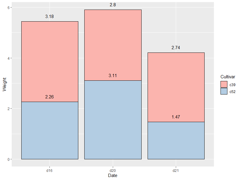
??发生甚么事了😕 图上的堆叠顺序和计算时的顺序反了所以标签位置有点问题。另外标签位置还需要上移或者下移一下。重来:
1
2
3
4
5
cabbage_exp %>% arrange ( Date , rev ( Cultivar )) %>%
group_by ( Date ) %>% mutate ( label_y = cumsum ( Weight )) %>%
ggplot ( aes ( x = Date , y = Weight , fill = Cultivar )) +
geom_col ( color = 'black' ) + scale_fill_brewer ( palette = 'Pastel1' ) +
geom_text ( aes ( y = label_y , label = Weight ), vjust = -1 )
排序的时候把Cultivar反转一下,标签位置上调一下就OK了😉